
Visualization Workflows
Adam Mattsson
2026-04-28
visualization_workflows.RmdIntroduction
This vignette provides a comprehensive guide to LundTaxR’s visualization functions (excluding the main heatmaps, covered in the Getting started with LundTaxR). Each section describes the function’s purpose, required and optional parameters, expected inputs, and output behavior, followed by practical examples with different parameter combinations. These tools help you interpret, present, and explore your classification results in a publication-ready format.
Forest Plots
plot_ratio_forest
Purpose: Visualizes odds ratios (from GLM) or hazard
ratios (from Cox models) for a set of signature scores or predictors,
using a forest plot. This function can call get_glm or
get_survival internally, or accept precomputed data.
Key Parameters:
-
these_predictions,these_samples_metadata: Output fromclassify_samplesand associated metadata (required unlessthis_datais provided) -
stat_plot: Set to"odds_ratio"(GLM) or"hazard_ratio"(Cox) -
categorical_factor: Categorical variable to test (for odds ratio) -
surv_time,surv_event: Survival columns (for hazard ratio) -
predictor_columns: Numeric columns to test (optional) -
this_subtype,subtype_class: Focus on specific subtype(s) and class -
scale,bin_scores,n_bins: Control scaling and binning of numeric scores -
col_bon,significant_p,sig_color: Adjust p-values and highlight significance -
return_data: Set to TRUE to return the data used for plotting
Expected Inputs:
- Output from
classify_samplesand matching metadata, or a data frame fromget_glm/get_survival
Output:
- A forest plot (ggplot object) visualizing odds or hazard ratios, optionally with significance annotation
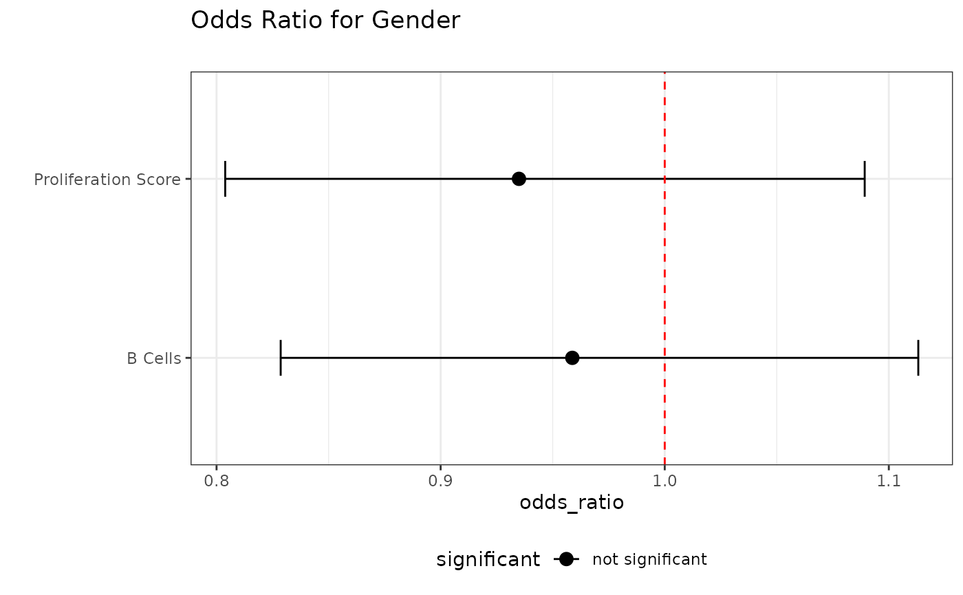
Example: Odds Ratio for Gender
# First, let's get the classification results
results <- classify_samples(
  this_data = sjodahl_2017,
  include_data = TRUE,
  verbose = FALSE
)

# Example 1: Plot using direct inputs (let the funciton internally run `get_glm`)
plot_ratio_forest(
  these_predictions = results,
  these_samples_metadata = sjodahl_2017_meta,
  stat_plot = "odds_ratio",
  plot_title = "Odds Ratio for Gender",
  categorical_factor = "gender",
  predictor_columns = c("b_cells", "proliferation_score"),
  col_bon = TRUE,
  scale = 100
)
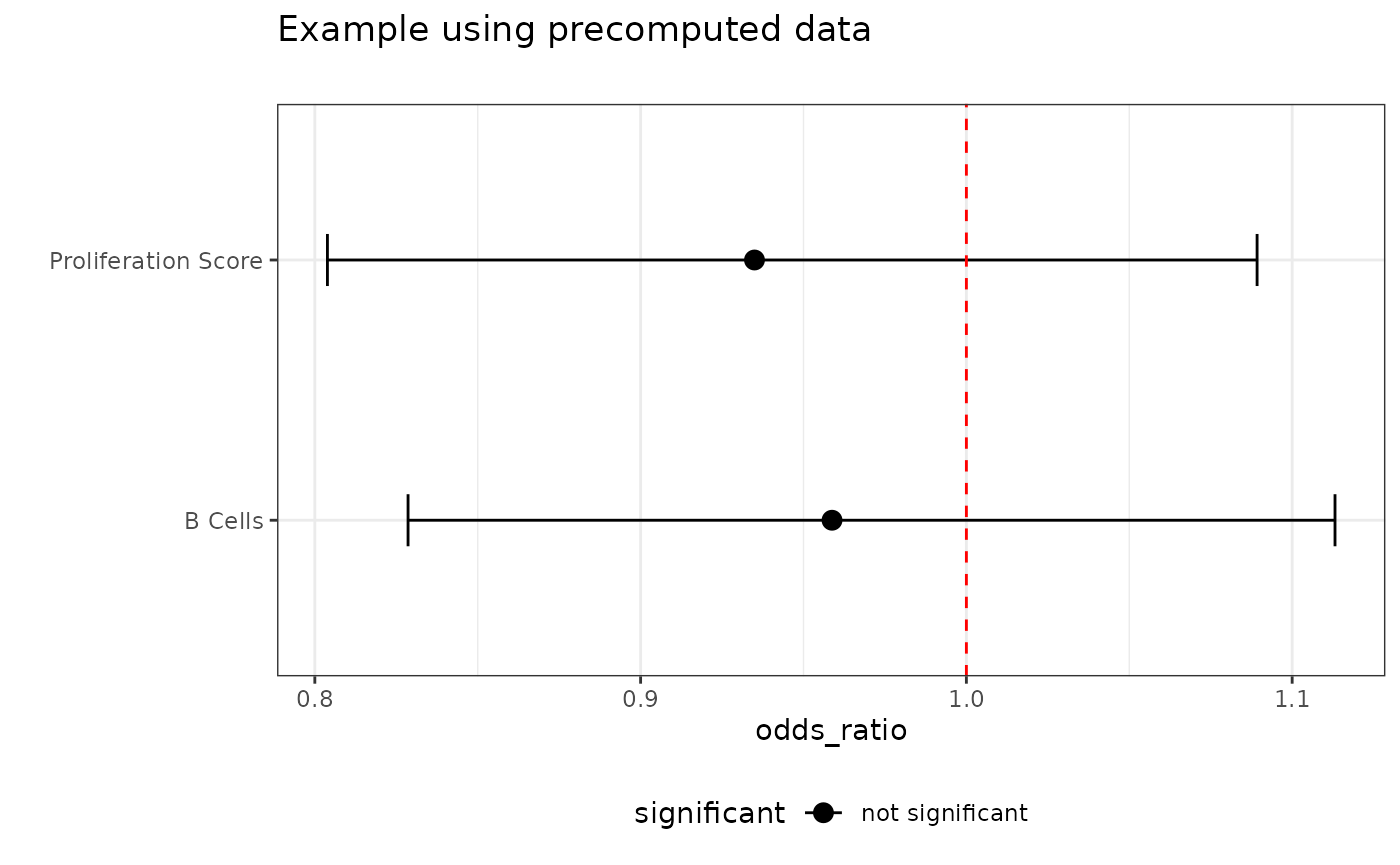
# Example 2: Using precomputed data
# First we need to run `get_glm` to get the data needed for plotting
glm_data = get_glm(
  these_predictions = results,
  these_samples_metadata = sjodahl_2017_meta,
  predictor_columns =  c("b_cells", "proliferation_score"),
  categorical_factor = "gender"
  )

# Visualize using the precomputed data
plot_ratio_forest(
  this_data = glm_data,
  stat_plot = "odds_ratio",
  plot_title = "Example using precomputed data"
  )
Example: Hazard Ratio for Overall Survival
# Example 1: Plot using direct inputs (let the function internally run `get_survival`)
plot_ratio_forest(
  these_predictions = results,
  these_samples_metadata = sjodahl_2017_meta,
  stat_plot = "hazard_ratio",
  plot_title = "Hazard Ratio for Overall Survival",
  surv_time = "surv_os_time",
  surv_event = "surv_os_event",
  n_bins = 10)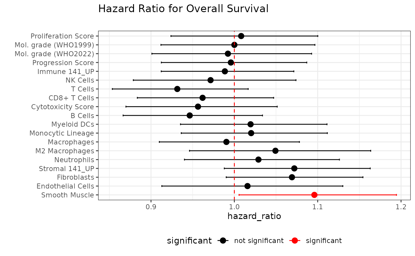
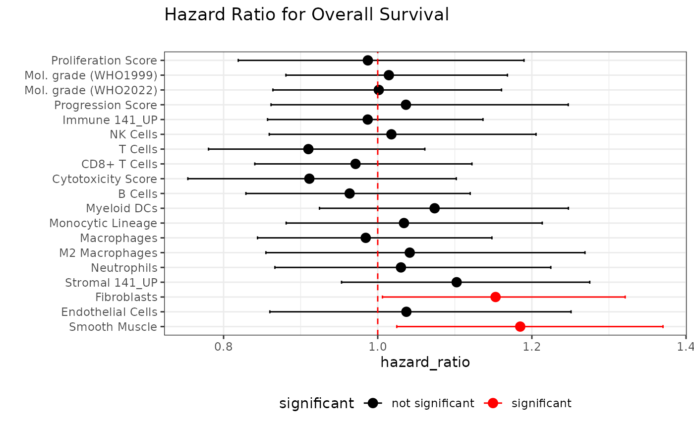
# Example 2: Using precomputed data
# First we need to run `get_survival` to get the data needed for plotting
  surv_data = get_survival(
  these_predictions = results,
  these_samples_metadata = sjodahl_2017_meta,
  surv_time = "surv_os_time",
  this_subtype = "Uro",
  surv_event = "surv_os_event"
  )

# Visualize using the precomputed data
plot_ratio_forest(
  this_data = surv_data,
  stat_plot = "hazard_ratio",
  plot_title = "Hazard Ratio for Overall Survival"
)
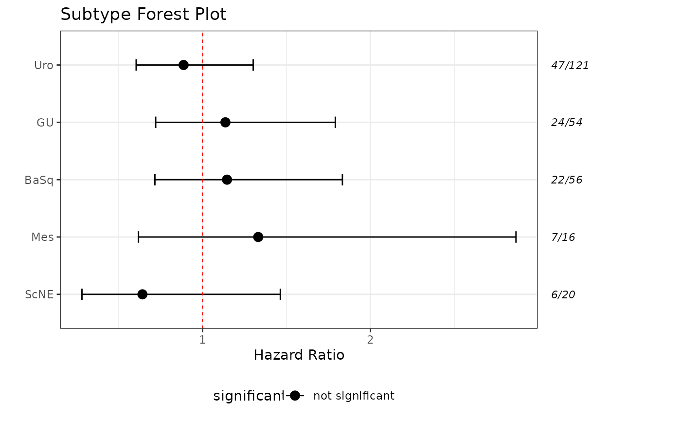
plot_subtype_forest
Purpose: Creates a forest plot for multiple subtypes based on Cox proportional hazards models, including a table of sample and event counts per subtype.
Key Parameters:
-
these_predictions,these_samples_metadata: Output fromclassify_samplesand metadata -
this_subtype: Vector of subtypes to include (e.g., c(“Uro”, “GU”)) -
subtype_class: “5_class” or “7_class” -
surv_event,surv_time: Survival columns -
plot_title,plot_subtitle,plot_caption: Plot annotations -
plot_width,plot_height,out_format,out_path,file_name: Output controls -
significant_p,sig_color: Significance annotation -
return_data: Set to TRUE to return the plot data
Expected Inputs:
- Output from
classify_samplesand matching metadata
Output:
- A combined forest plot and summary table (ggplot/patchwork object)
Example: All 5-class Subtypes, CSS Endpoint
plot_subtype_forest(
  these_samples_metadata = sjodahl_2017_meta,
  these_predictions = results,
  this_subtype = c("Uro", "GU", "BaSq", "Mes", "ScNE"),
  subtype_class = "5_class",
  surv_event = "surv_css_event",
  surv_time = "surv_css_time",
  plot_title = "CSS Hazard Ratios by Subtype"
)
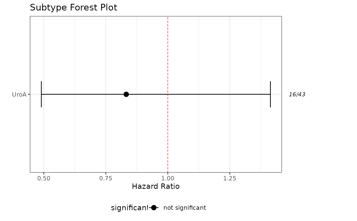
Example: UroA Only, PFS Endpoint
plot_subtype_forest(
  these_samples_metadata = sjodahl_2017_meta,
  these_predictions = results,
  this_subtype = "UroA",
  subtype_class = "7_class",
  surv_event = "surv_pfs_event",
  surv_time = "surv_pfs_time"
)
Ranked Score Plots
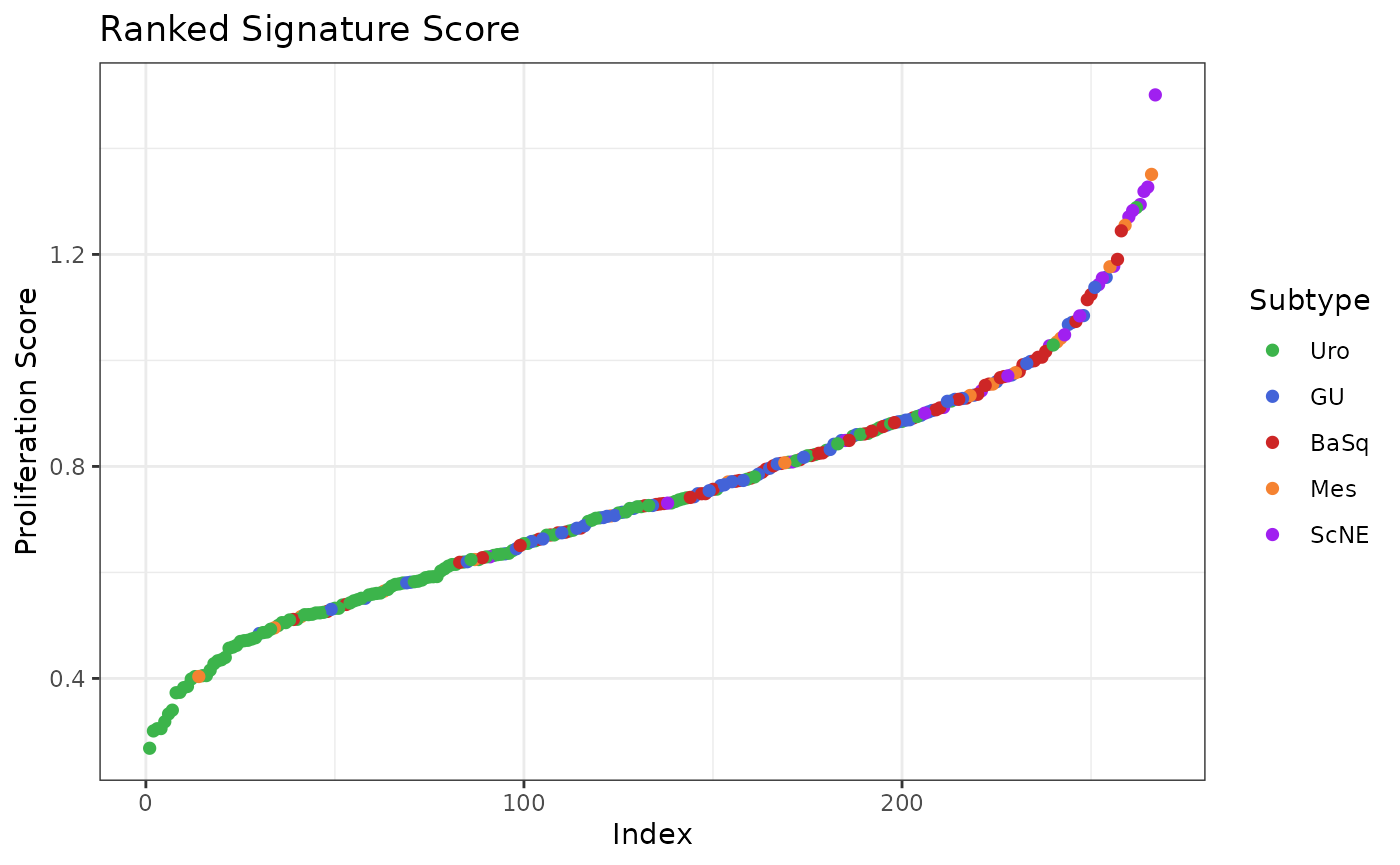
plot-ranked-score
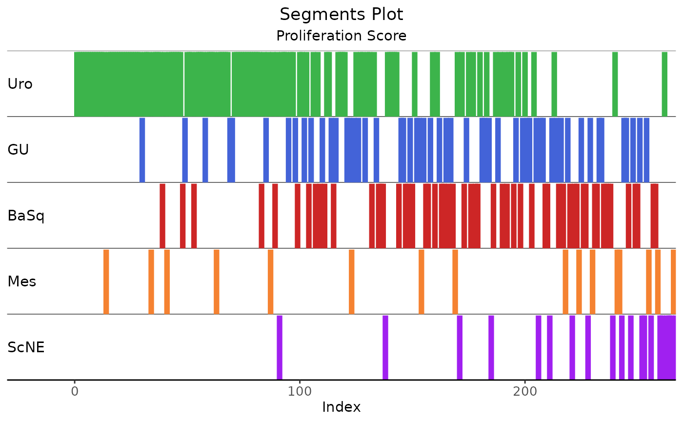
Purpose: Creates a point or segment plot of ranked signature scores for a selected variable, colored by subtype. Useful for visualizing score distributions and subtype separation.
Key Parameters:
-
these_predictions: Output fromclassify_samples -
this_score: Numeric column to plot (e.g., “proliferation_score”) -
this_subtype,subtype_class: Focus on specific subtype(s) and class -
seg_plot,seg_width: Use segment plot and control segment width -
add_stat: Add regression lines and p-values -
plot_title,out_path,out_format,plot_width,plot_height: Output controls -
return_data: Set to TRUE to return the formatted data
Expected Inputs:
- Output from
classify_samples
Output:
- A ggplot object (point or segment plot), or a data frame if
return_data = TRUE
Example: Ranked Proliferation Scores, All 5-class Subtypes
plot_ranked_score(
  these_predictions = results,
  this_score = "proliferation_score",
  subtype_class = "5_class"
)
Example: Ranked Segment Plot (Proliferation Scores), All 7-class Subtypes
plot_ranked_score(
  these_predictions = results,
  seg_width = 2,
  seg_plot = TRUE,
  this_score = "proliferation_score",
  subtype_class = "5_class"
)
Example: Return Formatted Data
ranked_data <- plot_ranked_score(
  these_predictions = results,
  this_score = "proliferation_score",
  subtype_class = "5_class",
  return_data = TRUE
)
head(ranked_data)
#>   sample_id     score subtype rank
#> 1     1.CEL 0.7310869     Uro  139
#> 2     2.CEL 1.0419366     Mes  242
#> 3     3.CEL 0.4846604      GU   30
#> 4     4.CEL 0.6596973     Uro  103
#> 5     5.CEL 0.8079496     Uro  170
#> 6     6.CEL 0.9343730      GU  219
Subscore Visualizations
plot_subscore_violin
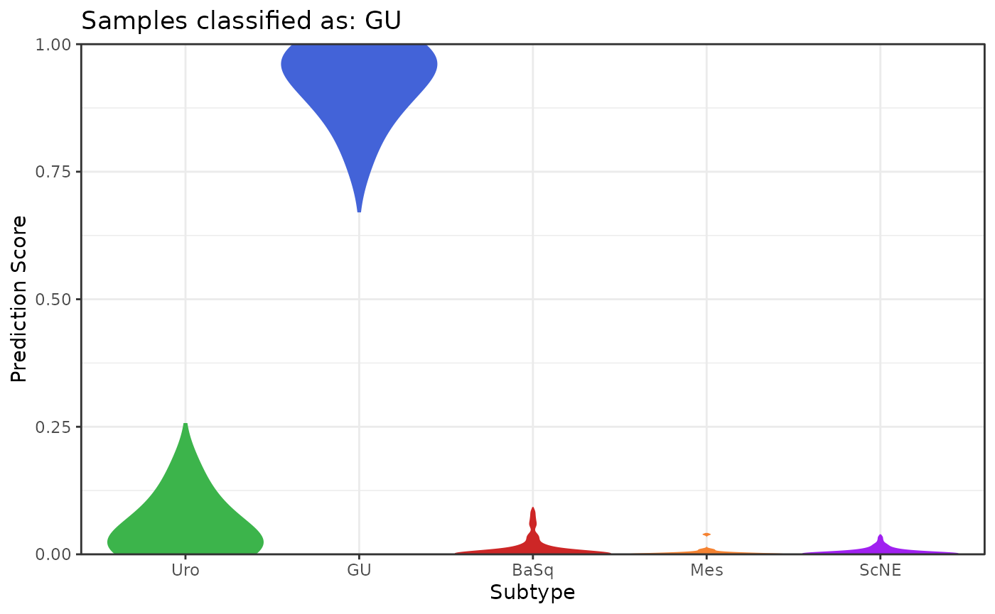
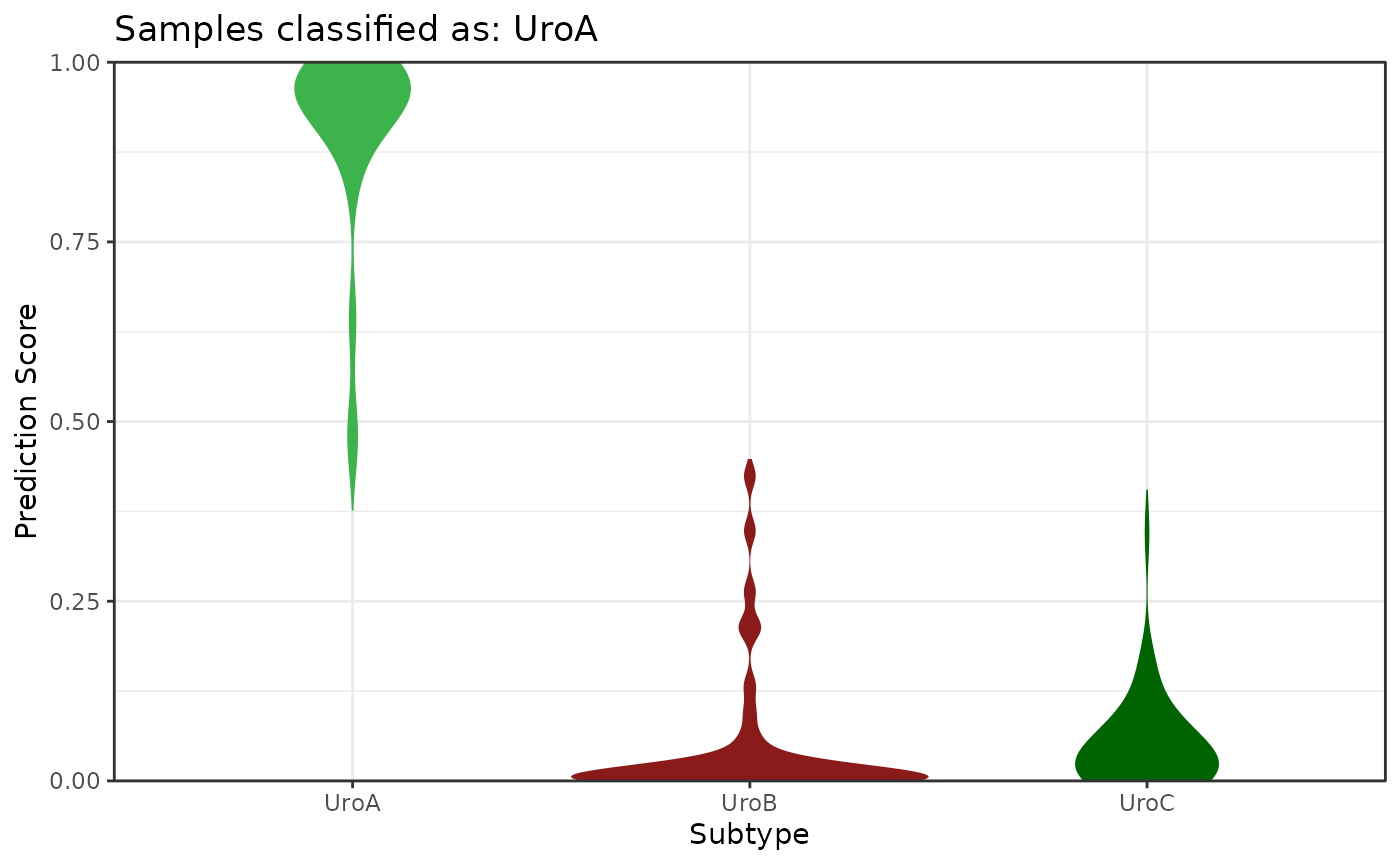
Purpose: Visualizes the distribution of subtype prediction scores for a selected subtype using violin plots. Useful for comparing score distributions across subtypes.
Key Parameters:
-
these_predictions: Output fromclassify_samples -
this_subtype: Subtype to plot (e.g., “GU”, “UroA”) -
plot_adjust: Bandwidth adjustment for violin smoothing -
plot_scale: Area, count, or width scaling for violins -
plot_trim: Whether to trim violin tails -
out_path,out_format,plot_width,plot_height: Output controls -
return_data: Set to TRUE to return tidy data
Expected Inputs:
- Output from
classify_samples
Output:
- A ggplot violin plot, or a tidy data frame if
return_data = TRUE
Example: GU Subtype, Adjust Bandwidth, No Trim
plot_subscore_violin(
  these_predictions = results,
  this_subtype = "GU",
  plot_adjust = 2,
  plot_trim = FALSE
)
Example: UroA Subtype, Area Scaling
plot_subscore_violin(
  these_predictions = results,
  this_subtype = "UroA",
  plot_scale = "area"
)
Example: Return Tidy Data
violin_data <- plot_subscore_violin(
  these_predictions = results,
  this_subtype = "GU",
  return_data = TRUE
)
head(violin_data)
#>   sample_id subtype      value
#> 1     3.CEL     Uro 0.06820000
#> 2     6.CEL     Uro 0.00820000
#> 3     9.CEL     Uro 0.19140000
#> 4    11.CEL     Uro 0.10140000
#> 5    14.CEL     Uro 0.03906667
#> 6    16.CEL     Uro 0.00840000
plot_subscore_box
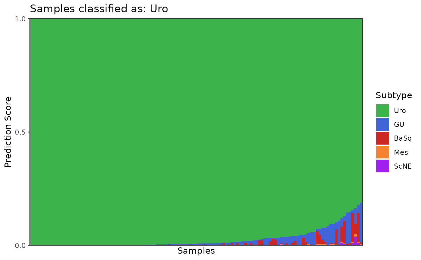
Purpose: Creates a stacked barplot of subtype prediction scores for a selected subtype, showing the distribution and ranking of scores.
Key Parameters:
-
these_predictions: Output fromclassify_samples -
this_subtype: Subtype to plot (e.g., “Uro”, “UroA”) -
out_path,out_format,plot_width,plot_height: Output controls -
return_data: Set to TRUE to return tidy data
Expected Inputs:
- Output from
classify_samples
Output:
- A ggplot stacked barplot, or a tidy data frame if
return_data = TRUE
Example: Uro Scores
plot_subscore_box(
  these_predictions = results,
  this_subtype = "Uro"
)
Example: Return Tidy Data
box_data <- plot_subscore_box(
  these_predictions = results,
  this_subtype = "Uro",
  return_data = TRUE
)
head(box_data)
#> # A tibble: 6 × 3
#>   sample_id subtype value
#>   <fct>     <fct>   <dbl>
#> 1 15.CEL    Uro         1
#> 2 15.CEL    GU          0
#> 3 15.CEL    BaSq        0
#> 4 15.CEL    Mes         0
#> 5 15.CEL    ScNE        0
#> 6 45.CEL    Uro         1
Each visualization function in LundTaxR is designed for flexibility
and publication-quality output. Adjust parameters and inputs as needed
for your research, and use the return_data option to
further customize or combine plots as needed.